Firstly open up Publisher and follow the path 'File; Page Setup' choose 'Printer and Paper' option and change paper size to A5 and Landscape. The result should look like this. If you don't have the red and blue border then you'll need to change this by going to 'View; Boundries and Guides'
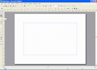
Next click on the 'Insert Table' icon (highlighted in the above pic) and click and drag
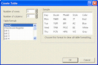
from the top left hand corner to the bottom right of the page. The following table will appear automatically. Choose 1 row and 2 columns and then OK.
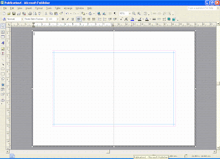
 Here is what you'll be left with, a greyscale table splitting the page in half. This table does not print and so I simply use it as a guide.
Next I import my pictures. For this Tutorial I'm using the Dad's Taxi set. I went to 'Insert; Picture; From File' and then chose the file I keep it in. As they are A4 in size, it appears huge on the page. If you prefer, you can zoom out here to see the whole page.
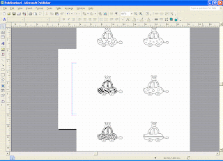
Click on the image page and you'll see white circles in each corner. Once this has been done a Picture Toolbar will appear (mine appears at the bottom but sometimes it's a floating one and sometimes it's at the top). Choose the CROP icon (highlighted below).
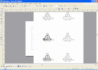 You will notive that the white circles will have changed to black lines. This tells you that it's ready to be CROPPED.
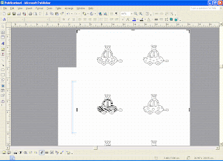
I then use these black lines to remove the items I don't want which leaves just the starry car. Click anywhere away from the image to remove the crop function.




10 comments:
cool idea thanks for sharing. may give that a go at some point. sue x
Great tutorial - only wish my version of publisher would not chop off the last 3cm of the printing! Thanks for sharing :-)
Thanks Paul thats a fab tutorial!!!!
I'll try that one tonight
thanks again and thanks for your great comment on my blog.....
Emma xxx
WOW this was a great tutorial and have been and played with some flower images I have. Was even brave enough to reset the table size so the image fitted onto a square card ! ! !
So excited by this as I can finally use the images & resize them to what I need ! ! !
Many thanks again,
Lou
x
Cool idea showing the tutorials! Might give me the motivation to start something :) xx
Fab tutorial Paul, this shows the teacher in you lol!!! Very useful :)
Elaine x
Thank you Paul...you make what sometimes seems a bit "techo" sooo easy.
Sue x
It is so nice of you to share all you share!
Good Person with good ideas!
Smiles & Cheers,
Dorothy
P.S.
There is some BLOG CANDY on my blog from me aand also a post of other peoples candy.
Brilliant Tut, Paul.. I have publisher will have ago at this one for sure.... Thanks for sharing...
Thanks Paul I've played around quite a bit with the images but didn't think of using the crop tool. It's a great idea. I'm a bit self taught on Publisher and it's TEN years since I did my ECDL. Water under the bridge (and on the brain) since then.
Post a Comment